Manuel Castro
Industrial Designer / Graphic Designer
A freelance project where the client wanted a rebranding where I explored color applications and made the brand more modern.
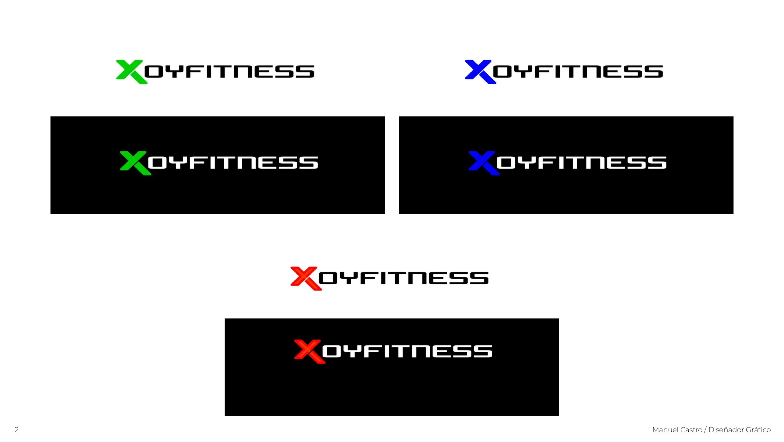
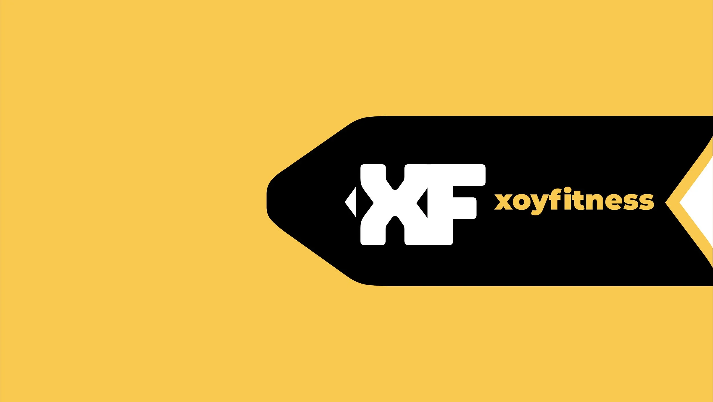
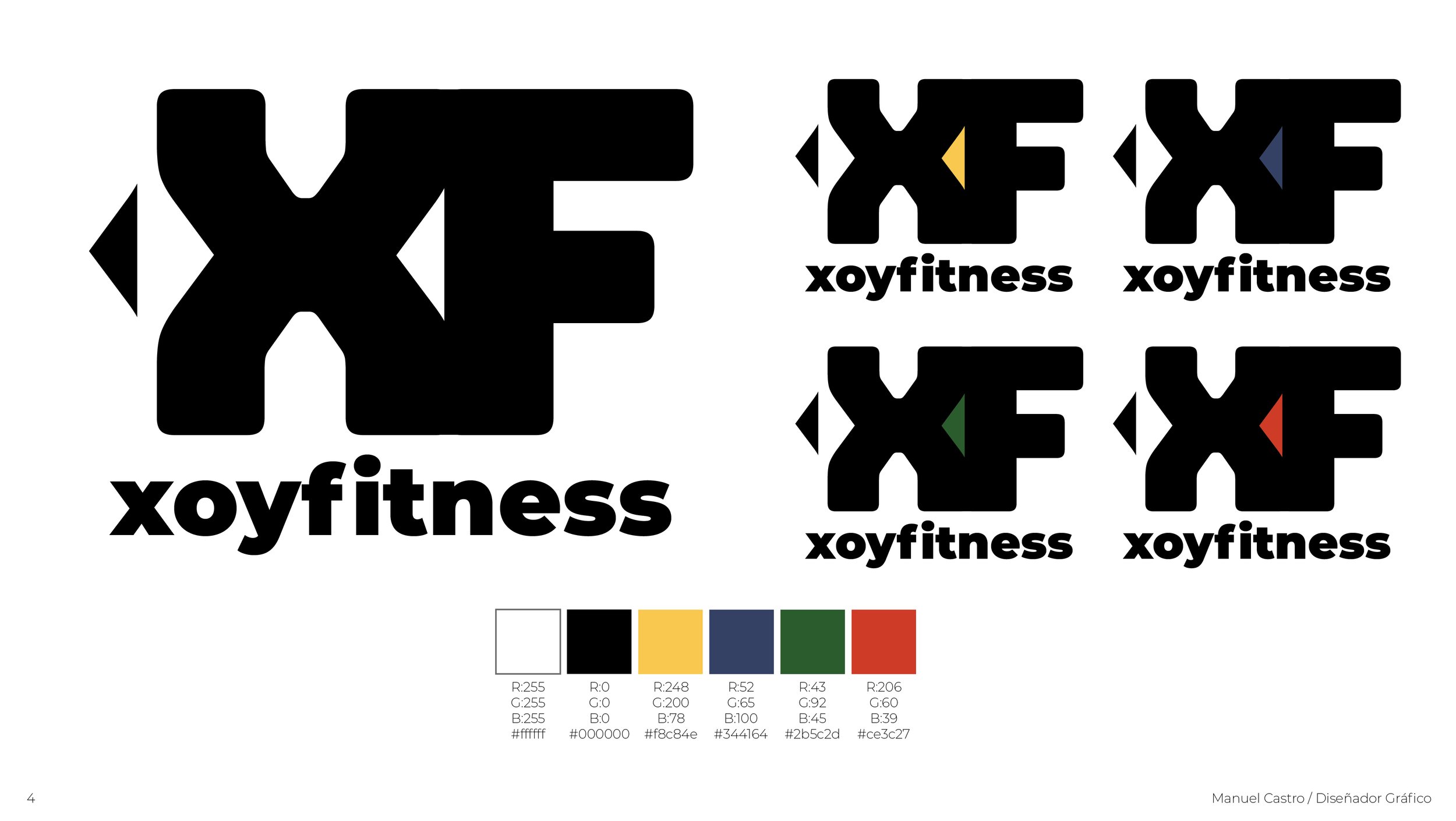
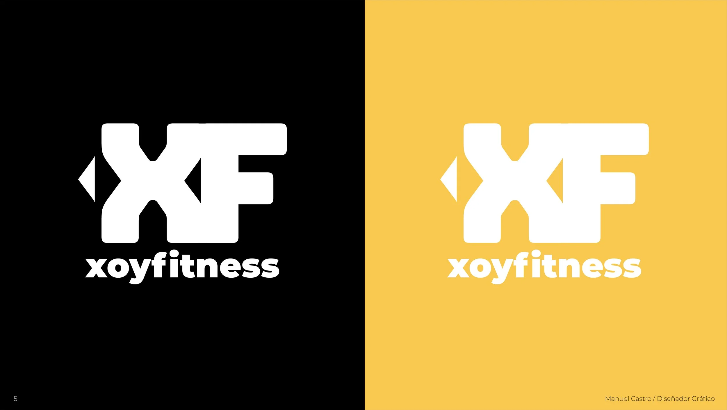
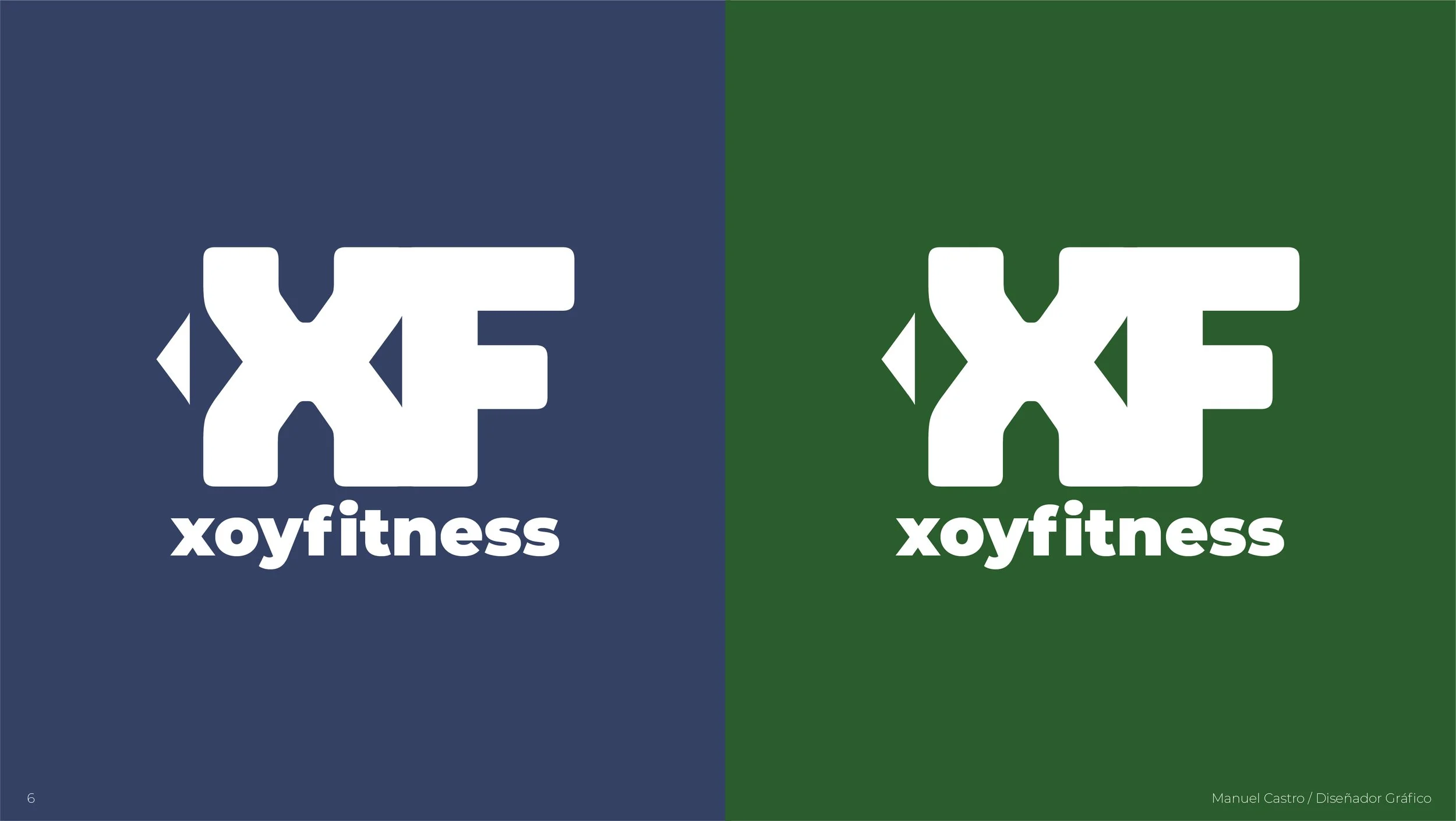
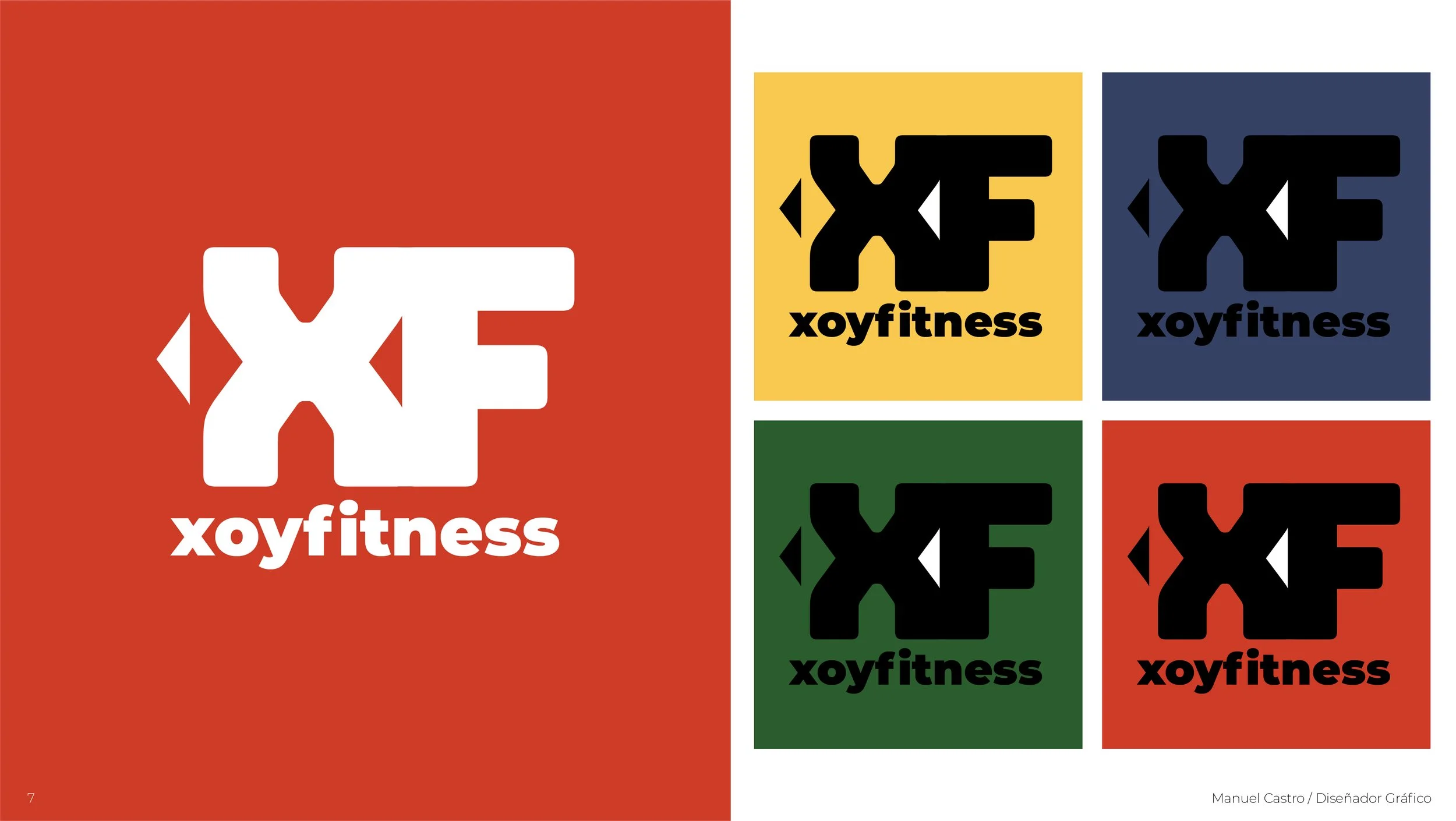
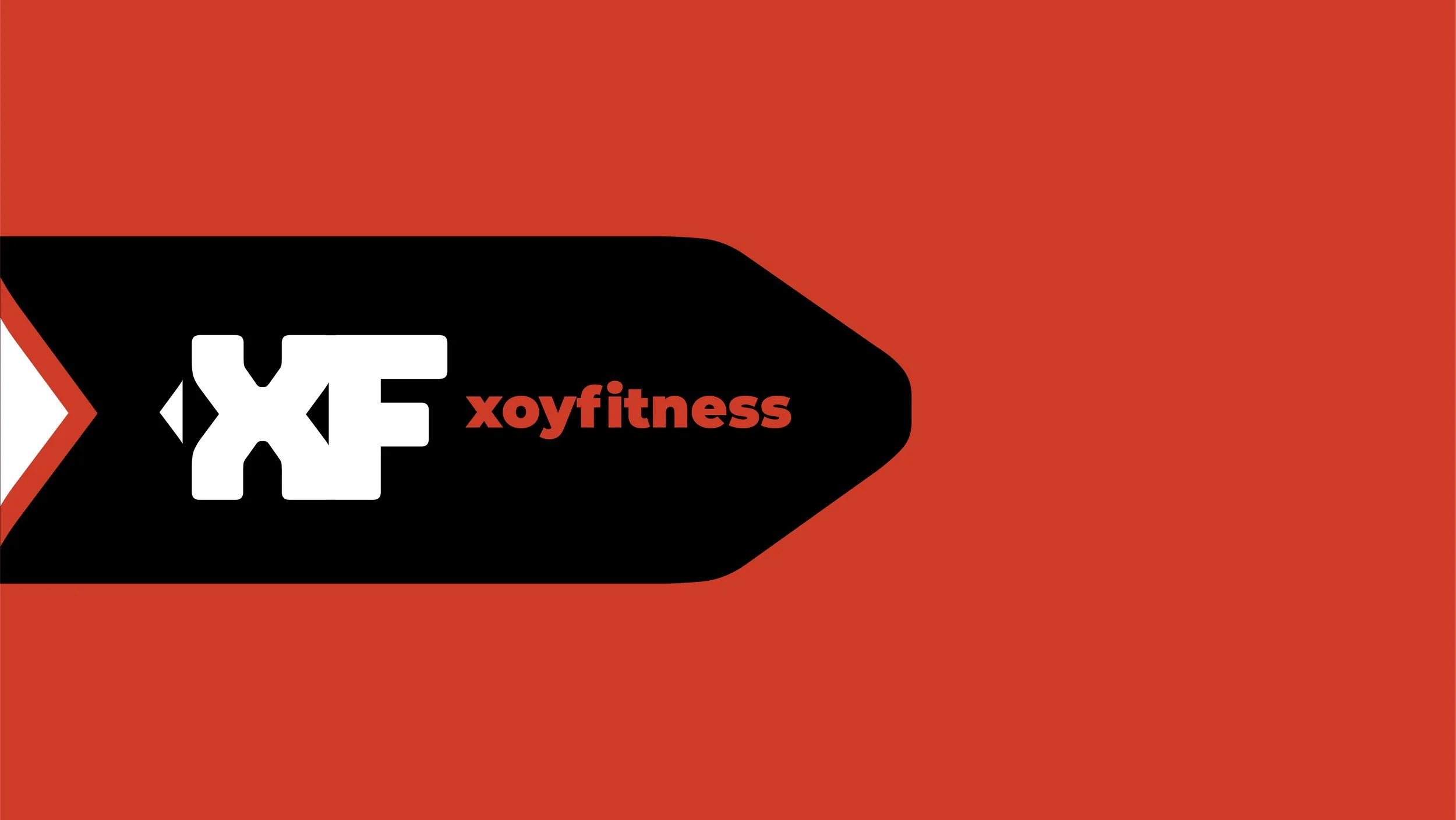
XoyFitness is a store that sells sports apparel online, this includes jogging machines, dumbells, and clothing apparel. The client requested to maintain a focal point on the “X” and to find a way to develop an isotype. Therefore, because the name may be complicated, I added the “F” so it’s easier to recognize the complete name of the brand.
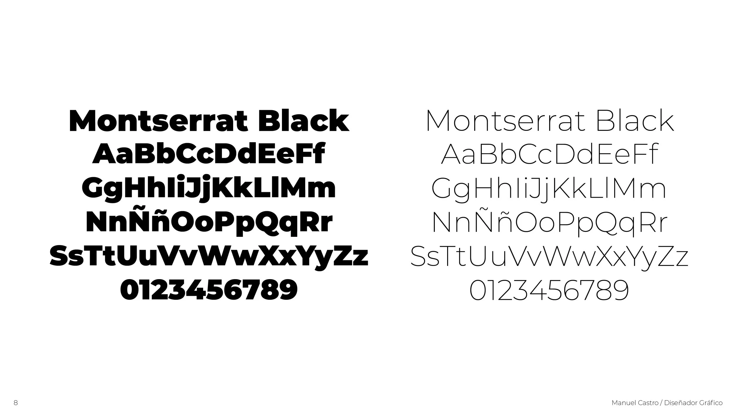
After several meetings with the client, I began with some research of related sports stores and their logos and continued with some sketching. After I found this idea through my exploration I researched for a font that worked best with my idea and applied it and manipulated it in Adobe Illustrator.
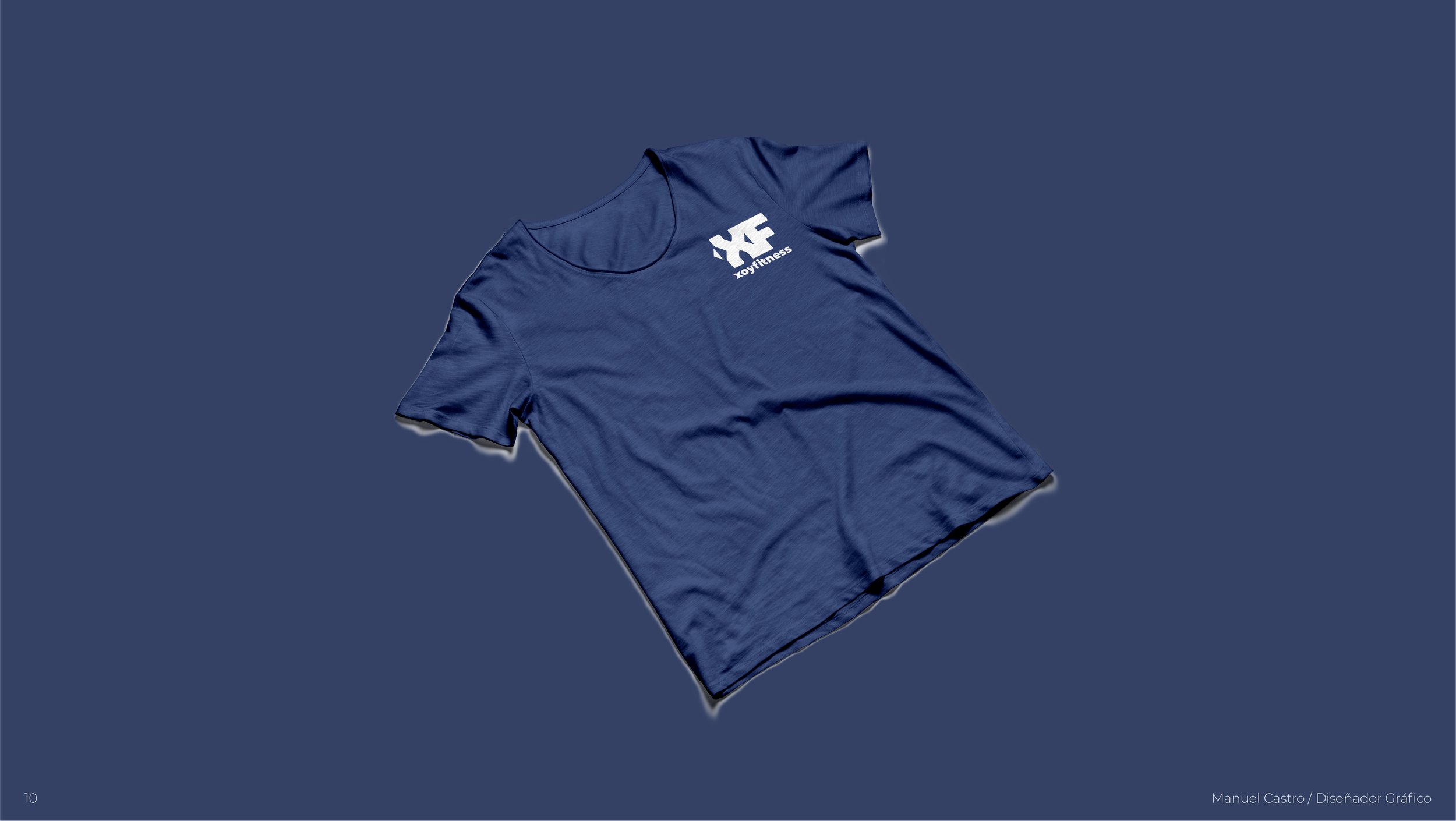
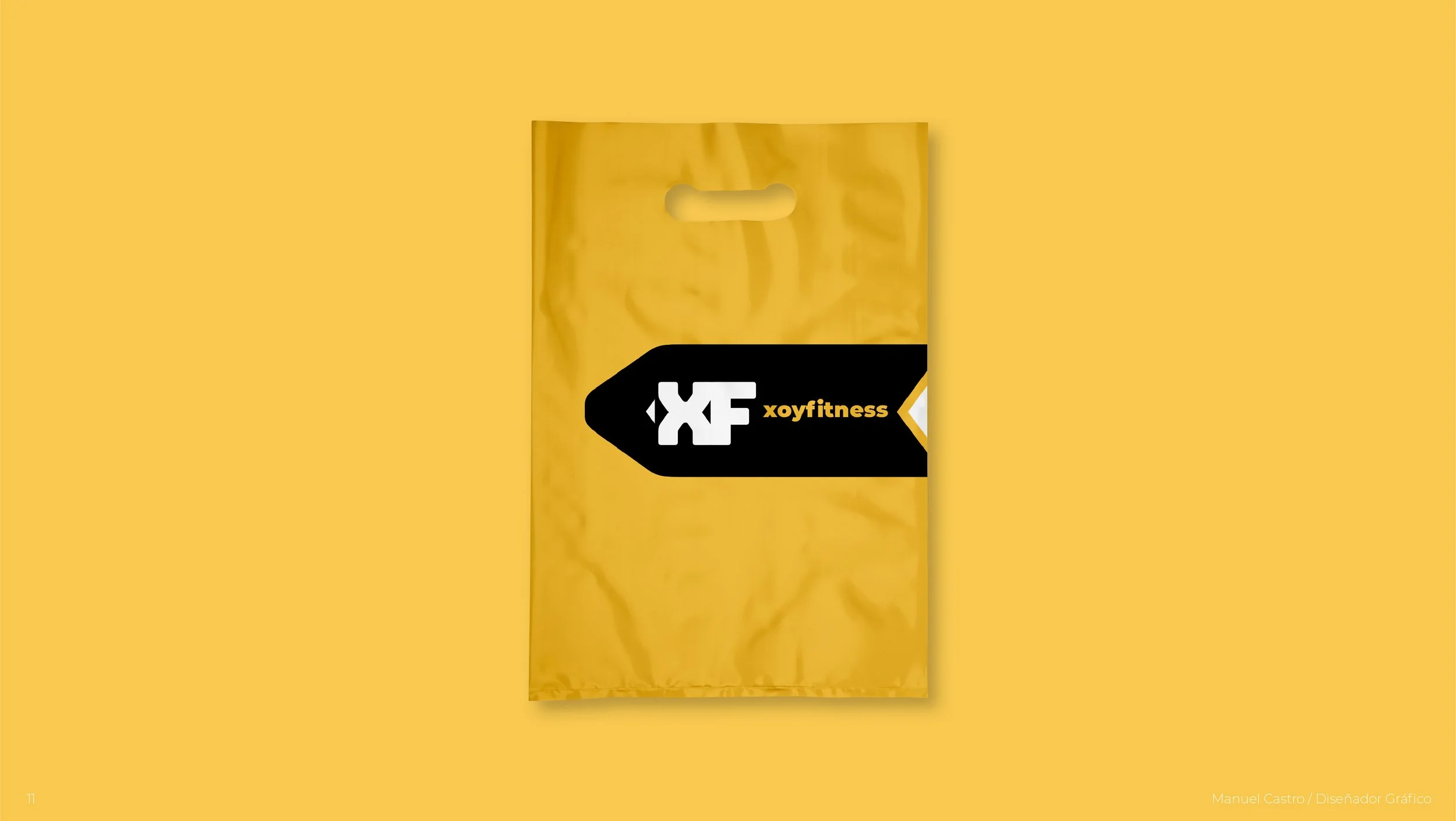
The colors utilized are primary but modern and give the brand a sense of identity and flexibility.